The client approached us with a brief to completely overhaul the brand identity as it prepared to launch its products in Tier 1 and Tier 2 cities. We needed to redesign the brand’s logo and packaging to introduce it to the larger market, while retaining its look and feel as a product targeted towards the middle class rather than a premium market.
We had several discovery sessions with the client, where we learned more about the brand’s philosophy, values, and products. Through our discovery sessions, we extracted the brand’s USPs — all their products were:
The brand’s philosophy was to distil the wisdom of our ancestors — who had used many of these same raw materials — into the brand’s products, retaining their natural goodness through these traditional methods.


We brainstormed as a team to discuss the points raised in the discovery call and evaluate how to communicate these through visuals.

We began with sketches, references, and a mood board to learn the client’s aesthetic preferences.
This is an integral part of our process because client feedback helps us understand what appeals to the client and allows us to eliminate certain stylistic directions that aren’t a match.
This is an integral part of our process because client feedback helps us understand what appeals to the client and allows us to eliminate certain stylistic directions that aren’t a match. Once the client had shared what design concepts they liked, we began creating sketches that would incorporate the key elements of the brand philosophy.
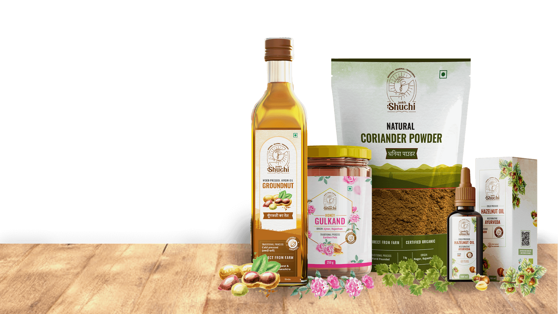
Our final logo depicts an adult hand bequeathing a leaf into a child’s hand, against the backdrop of the sun, to represent the brand’s philosophy. The logo contains the words “regional, seasonal, traditional”, and the word’s “Janki’s Shuchi” have small leaf-shaped accents as stylistic elements.
I am so impressed by your work and your team that now I don't like to work with anyone else, I always give your example to everyone around me and almost half of the Akola knows Niraali and Bokaap Design now.
We used various design elements in the packaging to continue our visual storytelling approach.
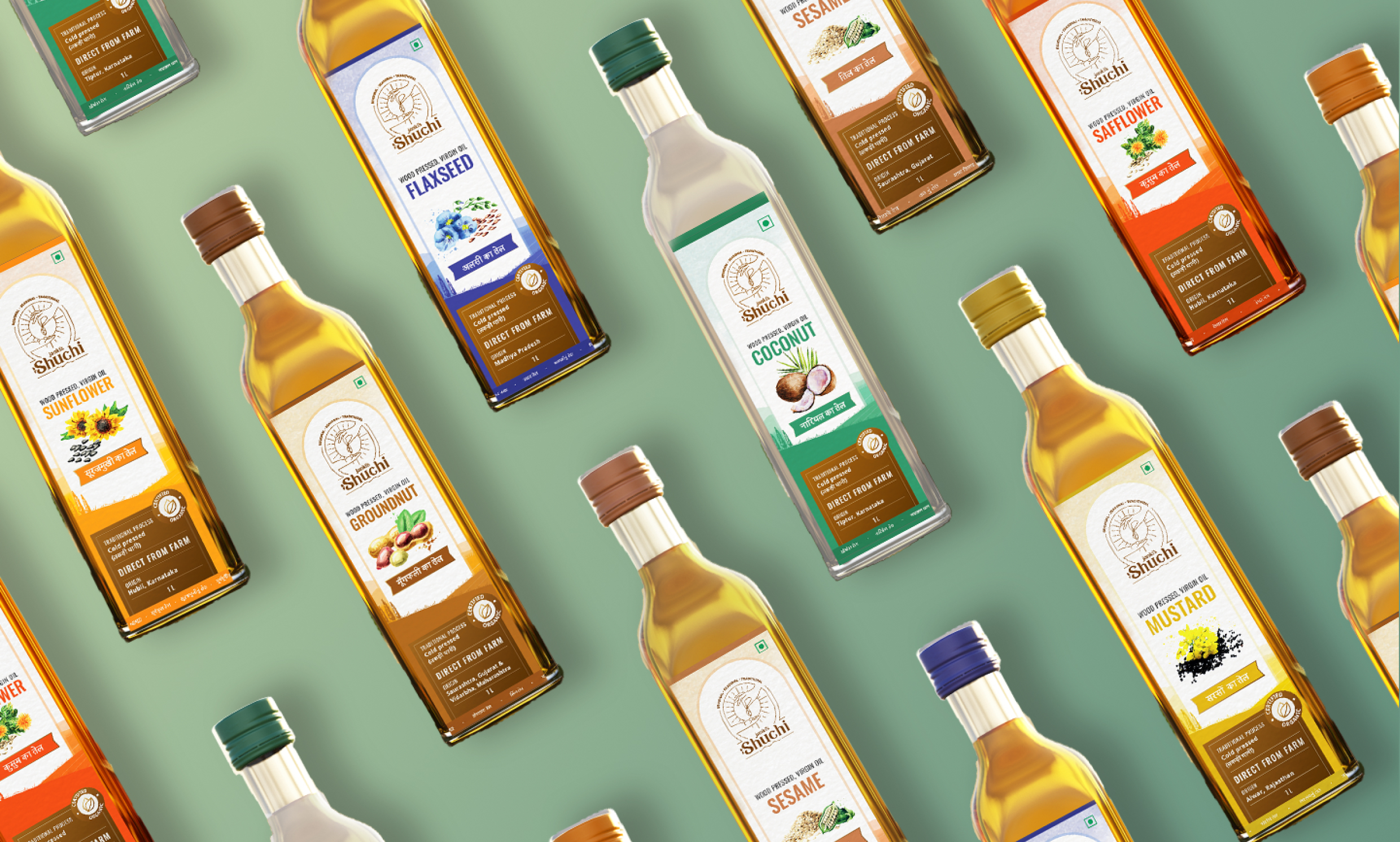
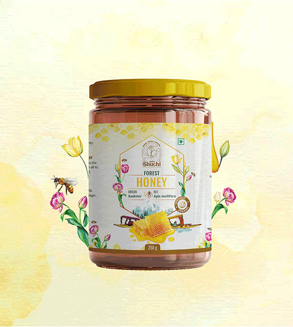
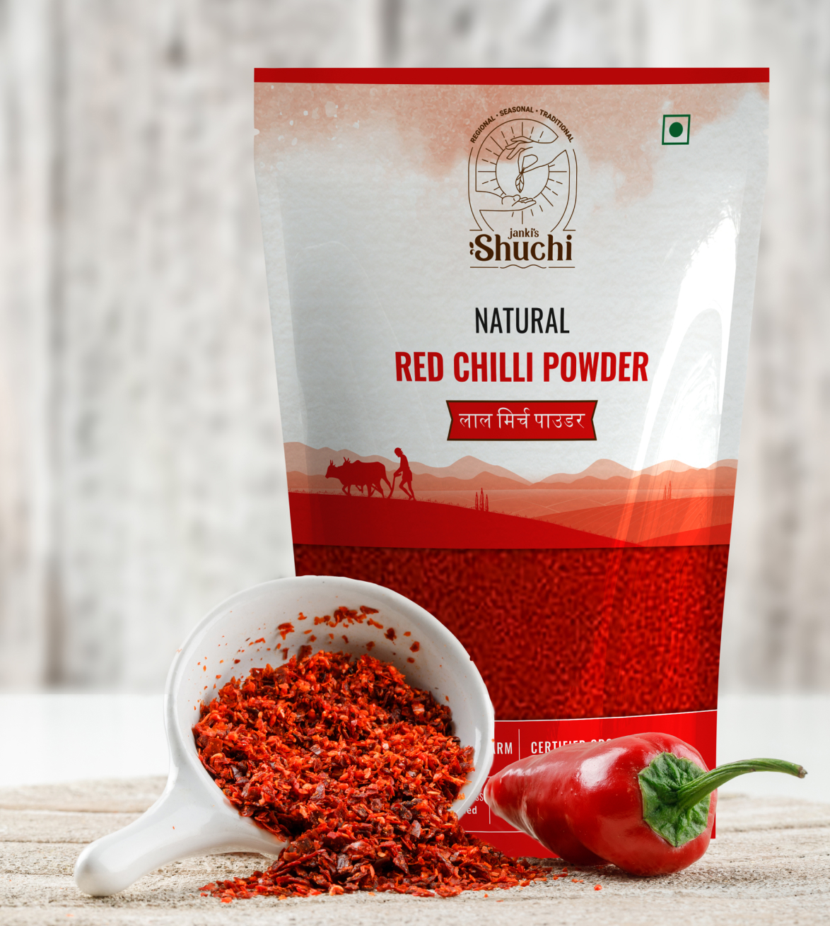
To show that the products were regional and direct from the farms, we created a large illustration of a traditional Indian farm, using a watercolour effect, as the canvas for the entire label. This was used on edible oils, jaggery, flour, and spices, and each product was differentiated with a unique primary label colour. We highlighted the regional aspect of all the products by prominently mentioning the region where the farms for the raw ingredients are located. For all the edible products (which include honey varieties), we used illustrations to share the story of the production process for each product type.

We used icons for information that needed to stand out at a glance, including icons for:


Since the brand wanted to expand its operations into Tier 1 and Tier 2 cities across the country, we wrote the product name for the edible oils in multiple regional languages to make it accessible to diverse consumers. We also mentioned the traditional process used to make each product on the front of the labels.

One of our biggest challenges with this project was the difficulty in conducting research because of COVID-19. Due to the lockdowns imposed, we were restricted to conducting our research online. This left out a large part of the competitor research and market research and analysis we would have otherwise conducted in stores. We overcame this by looking at our immediate circles for our target audience — mothers, mothers-in-law, and grandmothers. We asked them questions regarding what factors are important to them while buying these products and used our learnings to determine what information needed to be prominently displayed in the design. We also shared our initial designs with them to get post-design feedback and made changes according to their feedback.
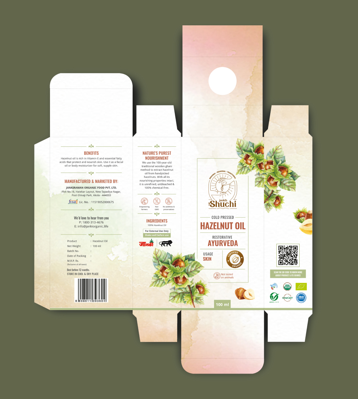

Perhaps the largest challenge we faced was an addition to the brief many months into the project. Some of the edible oils are also suitable for skincare and haircare, and the client decided to launch a completely new product category of cosmetic oils midway through the project. The new cosmetic oils category also included more oils that were exclusively for cosmetic use. This increased the project scope not just in terms of the number of products we had to design for, but we also had to create an entirely new design language for these cosmetic oils that were part of the Janki’s Shuchi brand.

